 Para Descargar PDF debe Abrir sesión.
Palabras clave: evidence gap maps, evidence-based medicine, systematic reviews as topic, data visualization
El gran aumento en la producción de evidencia científica ha llevado a la creación de métodos para facilitar su revisión y síntesis, surgiendo distintos diseńos según el objetivo principal que se busque cumplir. Los mapas de brecha de evidencia constituyen un enfoque novedoso de revisión de literatura. Corresponden a colecciones temáticas de un amplio campo de evidencia, utilizando una estrategia de búsqueda sistemática que destaca por identificar brechas o lagunas en el cuerpo de la evidencia disponible y por involucrar tempranamente a la audiencia definida como blanco para el diseńo de un producto gráfico amigable. Se han establecido como una herramienta a considerar para guiar la agenda y el financiamiento de futuras investigaciones, y como apoyo en la toma de decisiones y en la creación de políticas basadas en evidencia. Los formatos más utilizados para representar sus hallazgos son el gráfico de burbujas y la grilla intervención-desenlace. Este artículo corresponde al sexto de una serie de revisiones narrativas acerca de tópicos generales en bioestadística y epidemiología clínica, y tiene por objetivo describir las características generales de los mapas de brecha de evidencia, destacar sus principales objetivos y utilidades, explorar los formatos de mapeo más utilizados y comparar este enfoque con otras propuestas de síntesis.
|
Main messages
|
The volume of scientific information being generated is overwhelming and is currently on the order of one manuscript every 10 to 20 seconds[1]. The large number of primary and secondary studies added to the various databases (and other sources) generates the need to create a systematic, exhaustive, and graphic approach to facilitate the search for answers in decision-making[1],[2]. Among the many available options for synthesizing evidence, the following designs stand out:
Evidence gap maps are tools focused on facilitating researchers, clinicians, and policymakers (among other stakeholders) to visualize and explore the available evidence, both from primary studies and systematic reviews, around a specific question, through a graphical and ergonomic product[2],[6].
This article corresponds to the sixth in a methodological series of narrative reviews on general biostatistics and clinical epidemiology topics that explore and summarize, in an accessible language, published articles available via the main databases and specialized consultation texts. The series is aimed at training students, clinicians, and researchers. The Evidence-Based Medicine team from the School of Medicine of the Universidad de Valparaiso, Chile, in collaboration with the Research Department of Instituto Universitario Hospital Italiano de Buenos Aires, Argentina, and the Evidence Center UC, of the Universidad Católica, Chile have worked on the series. This article reviews the general aspects of evidence gap maps, main objectives and utilities, most relevant graphical options of mapping, interpretation, relevant aspects of their methodology, and comparison with other synthesis approaches.
Evidence gap maps emerged in 2003, and by 2010, had less than ten publications[2]; however, over the next decade, they increased in popularity, reaching more than 73 publications as of 2017[6],[7],[8],[9]. The organizations most involved in their generation and dissemination include the International Initiative for Impact Evaluation (3ie) (www.3ieimpact.org) and the Campbell Collaboration (www.campbellcollaboration.org).
Evidence gap maps can be defined as thematic collections of evidence structured around a framework that graphically and schematically represents the types of interventions and outcomes relevant to a particular problem[6]. Therefore, they are conceived as a systematic, illustrative, and broad organization, with the intention of characterizing the breadth, depth, and methodology of the relevant evidence in relation to a certain question, finally elucidating the gaps in knowledge[10].
In 2016, Miake-Lye et al. conducted a systematic review about the definition and methodology of evidence gap maps, whose findings show heterogeneity when describing and developing them. Their results highlight the following key components to define an evidence gap map:
In summary, evidence gap maps involve a systematic search in order to identify the available evidence on a broad topic, and the systematization of knowledge gaps and/or future research needs, presenting the results in a user-friendly format, often with a graphical representation or accessible grid[2].
As a tool, evidence gap maps are restricted to providing information on the available evidence, knowledge gaps on different interventions and their outcomes, although the methodology is expanding to the areas of prognosis, diagnosis, and possibly other areas of knowledge. However, they do not allow answering a specific research question because they do not seek to synthesize the findings of the included studies. Consequently, evidence gap maps are not intended to provide recommendations or inform policy and practice but rather to be one of the sources of information in the development of these studies[11],[12].
The purposes of evidence gap maps can be simplified into two broad axes as follows:
1. To facilitate evidence-based decision-making by presenting the available evidence in an accessible format
Systematic reviews are frequently used to answer clinical questions, but with their increasing production it is becoming more difficult to identify which one offers the best evidence. Despite the efforts made by the organizations focused on evidence synthesis, including Cochrane and Campbell, systematic reviews are being published in a variety of information sources, without a mandatory central repository for authors or publishers. Furthermore, systematic reviews may be available in inaccessible formats (other than the traditional peer-reviewed and published manuscript, e.g., preprints, proceedings, protocols, conference abstracts, etc.). Unfortunately, the methodological language sometimes makes it difficult for the untrained clinician to identify the main findings, and these findings fail to impact their work as they should[6].
In response, evidence gap maps provide an accessible summary, capable of providing information (e.g., existing systematic reviews on a given topic), allowing the reader to quickly and efficiently compare the availability and quality of evidence on different interventions. However, if trained research teams are available for this purpose, the evidence gap maps can be produced quickly (in less than six months), while identifying the most up-to-date and best quality systematic reviews and ensuring the availability of updated findings when required by stakeholders[6].
2. To facilitate the strategic use of research resources by identifying gaps in the available evidence where future research should be focused
Asking a necessary and appropriate research question remains a challenge. Much of the available evidence does not meet this feature, and a surprising number of studies lack the necessary quality, development, and analysis[10]. In this way, more than 85% of the global annual investment in research is allocated erratically due to correctable problems[13], such as choosing to answer a non-priority question, conducting poorly designed studies, and failing to properly and transparently report on the results of the investigations[10]. In addition to this is the lack of systematization in the evaluation of the body of evidence in the field to be investigated[10], which gives rise to selective citation, cherry-picking, or the fallacy of incomplete evidence. This consists of the usual practice of choosing those papers that are more available, more attractive, or those that confirm our beliefs, ignoring evidence that is less accessible or that contradicts us[14].
Thus, the evidence gap mapping approach offers solutions. The visual representation it provides allows us to establish areas where new primary studies or systematic reviews can add more value depending on the type of gap identified. The types of breaches are as follows:
In addition, evidence gap maps can highlight a variety of issues related to the quantity, quality, and characteristics of the existing body of evidence. Thus, they can inform a strategic approach to evidence development on a particular problem. In fact, by identifying the areas of high relevance for policy development with a lack of evidence, evidence gap maps can be a tool to guide researchers and funders to ensure that limited research resources support studies that address the critical evidence gaps[6].
Understanding the methodology of evidence gap mapping is a key element in characterizing this approach and differentiating it from other study designs. The following is a general summary of their methods (For a detailed guide with recommendations for conducting an evidence gap map, it is suggested to review leading publications[6],[11],[12],[16]):
As mentioned previously, there is no standardized method for conducting an evidence gap map to date[2]. A recent instrument that can provide guidance for reporting this type of synthesis is the Preferred Reporting Items for Systematic Reviews and Meta-Analyses (PRISMA) extension for scoping reviews (PRISMA-ScR), which provides a list of key items to check in each section of the manuscript to be published[17]. For more information on this extension, it is recommended to consult the article on panoramic reviews belonging to this methodological series or consult the extension directly at http://www.prisma-statement.org/Extensions/ScopingReviews[17].
The presentation of the results of an evidence gap map is varied, with three main forms as follows:
Most evidence gap maps use variations of crisscrossed tables (or grids) for the main findings, aggregating the count or sum of publications, organized into various domains, most often categorized by the available interventions and/or study designs while considering outcomes. It is also possible to find flow and bar charts to summarize the main findings of an evidence gap map. It is common to find more than one graphical representation per article[2].
The most commonly used forms of mapping are described in the following sections.
Bubble plot
This format graphs the information in five dimensions as follows:
A bubble plot used to report the findings in a published evidence gap map can be found in Figure 1[18].
Figure 1.Bubble plot used by an evidence gap map.
One type of format frequently used is a digital grid that includes in-terventions and outcomes, with links to summaries of the studies included in their evidence gap maps[15]. Usually, the rows and columns correspond to interventions and outcomes, respectively. When plac-ing the cursor over an intervention or outcome, the platform reveals a brief description. The bubbles positioned in the intersection cells of both axes represent the studies in a given area, and their size is related to the number of studies. The color of the bubbles indicates the type of evidence and its degree of confidence in relation to their effects, with three colors assigned to systematic reviews (green: high confi-dence; orange: medium confidence; red: low confidence), purple assigned to protocols of a future systematic review, and gray assigned to impact evaluations[19]. This format is frequently used by the 3ie organization, an example of which is shown in Figure 2[20].
Figure 2. Digital intervention–outcome framework.
Another framework is used by the Sightsavers organization (www.sightsavers.org) (Figure 3). Their evidence gap maps are based on a matrix designed to capture evidence on specific interventions or areas. The areas for which reviews were found are located in the col-umns, while the rows correspond to the strength of the evidence. Bubbles within the cells denote the existence of systematic or narra-tive reviews, whereas placing the cursor over one of them displays a summary page[15]. The color code represents the methodological quali-ty of the review (green: high; yellow: medium; red: low)[21].
Figure 3. Glaucoma evidence gap map from the Sightsavers organization.
Flow or bar diagrams
Some authors of evidence gap maps have reported their main findings in flowchart formats (Figure 4) or bar charts (Figure 5), being like the diagrams widely used to describe the systematic search process in scientific articles.
Figure 4. Evidence map on publications of sugar-sweetened concoctions by outcome and study type.
Figure 5. Bar chart of health topics explored within the references included in an evidence gap map.
Evidence gap maps and systematic reviews have in common their secondary study design, which collects the available evidence through a comprehensive systematic search approach, with an identical screen-ing process of studies. Compared to systematic reviews, evidence gap maps have a broader scope, require less data extraction, and do not synthesize effect estimators. They do not require critical appraisal of the quality of the evidence (although it is recommended)[15] and can be conducted in less time[6]. The product is also different; evidence gap maps report the available evidence (not the results of the interven-tions) to be used in the prioritization of future research, unlike sys-tematic reviews that report the results of the included studies, con-tributing to knowledge translation and the generation of recommen-dations for clinical practice and health policy-making[15].
Scoping reviews, such as evidence gap maps, correspond to an evi-dence synthesis approach that aims to map the existing literature in an area of interest[4]. They are the most similar study design, with identical methodologies to the point of sharing the PRISMA-ScR[17]. The main differences are that evidence maps involve the target audi-ence earlier in the research process, the rigor of the search strategy, and offering an accessible visual product or grid in a user-friendly format[2].
Table 1 describes the main differences of evidence gap maps with other options of evidence synthesis.
Table 1. Comparison of evidence gap maps with other forms of synthesis.
Evidence gap maps are a relatively new tool in literature review, offering a systematic search approach that identifies a field of available evidence, highlighting areas where knowledge gaps exist. They stand out for early involvement of the target audience, in order to design a user-friendly and easily accessible graphic product that summarizes the findings. The most commonly used formats are the bubble plot and the intervention–outcome framework.
Their production has been increasing in recent years, as they are of valuable use to decision-makers in defining the agenda and funding for future research, supporting evidence-based policy-making, and ensuring a faster and less resource-intensive final product than other study designs.
Contributor roles
BSM: conceptualization, investigation (original draft preparation), writing (review and editing), project administration. NMC, CL, JVAF: writing (review and editing). JPB: conceptualization, resources, writing (review and editing), supervision. EMA: writing (review and editing), supervision.
Acknowledgments
We are grateful to the Chair of Evidence-Based Medicine of the School of Medicine of the Universidad de Valparaíso, Chile, for promoting this series and the collaboration of the Research Department of the Instituto Universitario del Hospital Italiano de Buenos Aires, Argentina.
Competing interests
The authors declare that they have no conflicts of interest.
Funding
The authors declare that they have no external sources of funding associated with this article.
Language of submission
Spanish.

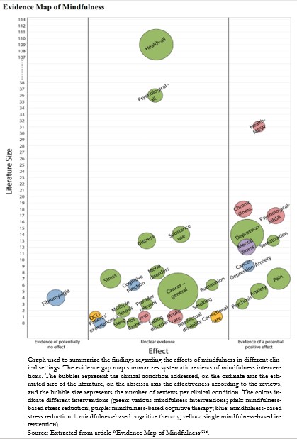 Figure 1.Bubble plot used by an evidence gap map.

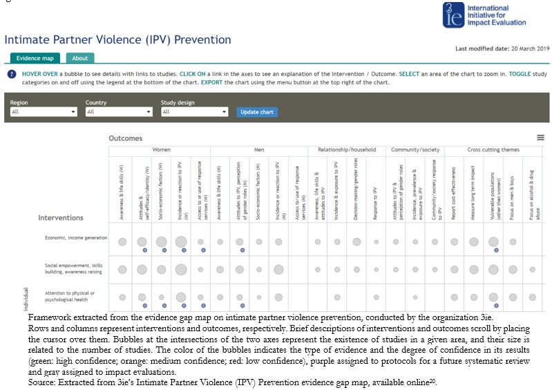 Figure 2. Digital intervention–outcome framework.

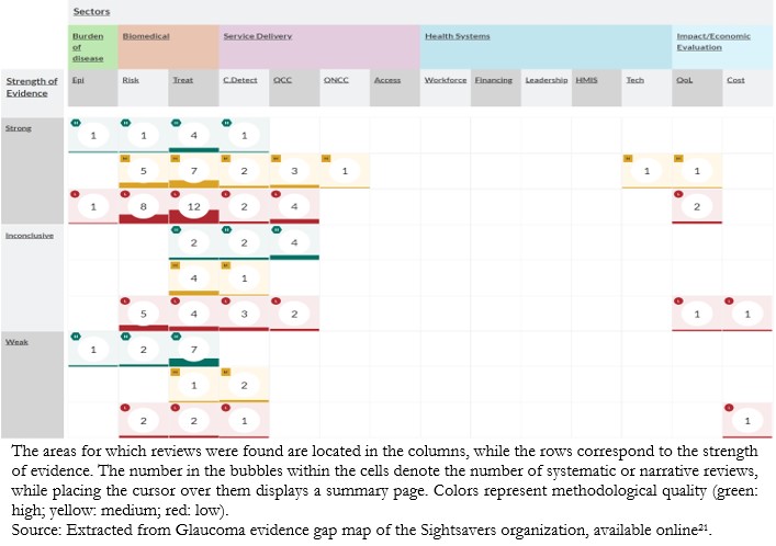 Figure 3. Glaucoma evidence gap map from the Sightsavers organization.

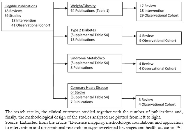 Figure 4. Evidence map on publications of sugar-sweetened concoctions by outcome and study type.

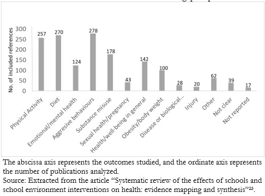 Figure 5. Bar chart of health topics explored within the references included in an evidence gap map.

 Table 1. Comparison of evidence gap maps with other forms of synthesis.
 Esta obra de Medwave está bajo una licencia Creative Commons Atribución-NoComercial 3.0 Unported. Esta licencia permite el uso, distribución y reproducción del artículo en cualquier medio, siempre y cuando se otorgue el crédito correspondiente al autor del artículo y al medio en que se publica, en este caso, Medwave.

The significant increase in scientific evidence production has led to the creation of methods to facilitate evidence review and synthesis. This has turned, this has resulted in the emergence of different designs depending on the review’s objective. Evidence gap maps constitute a novel approach for literature review. They are thematic collections of a broad field of evidence, using a systematic search strategy that identifies gaps in knowledge and engages, early on, the target audience to design a friendly graphic product. Evidence maps are a tool to be considered in the roster of options available for research funders in that they are particularly useful for evidence-based decision-making and evidence-based policy development. The most commonly used formats to display the findings of evidence gap search designs are the bubble plot and the intervention-outcome framework. This article corresponds to the sixth of a series of narrative reviews on general topics of biostatistics and clinical epidemiology. The purpose of this review is to describe the principal features of evidence gap maps, highlighting their main objectives and utility, exploring the most commonly used mapping formats, and comparing this approach with other evidence synthesis designs.
 Authors:
Bastián Schuller-Martínez[1], Nicolás Meza[2], Javier Pérez-Bracchiglione[2], Juan Víctor Ariel Franco[3], Cristóbal Loezar[2], Eva Madrid[2]

Citación: Schuller-Martínez B, Meza N, Pérez-Bracchiglione J, Franco JVA, Loezar C, Madrid E. Graphical representation of the body of the evidence: the essentials for understanding the evidence gap map approach. Medwave 2021;21(3):e8164 doi: 10.5867/medwave.2021.03.8164
Fecha de envío: 28/10/2020
Fecha de aceptación: 29/3/2021
Fecha de publicación: 23/4/2021
Origen: Not commissioned
Tipo de revisión: Externally peer-reviewed by three reviewers, double-blind

Nos complace que usted tenga interés en comentar uno de nuestros artículos. Su comentario será publicado inmediatamente. No obstante, Medwave se reserva el derecho a eliminarlo posteriormente si la dirección editorial considera que su comentario es: ofensivo en algún sentido, irrelevante, trivial, contiene errores de lenguaje, contiene arengas políticas, obedece a fines comerciales, contiene datos de alguna persona en particular, o sugiere cambios en el manejo de pacientes que no hayan sido publicados previamente en alguna revista con revisión por pares.
Aún no hay comentarios en este artículo.
Para comentar debe iniciar sesión
 Medwave publica las vistas HTML y descargas PDF por artículo, junto con otras métricas de redes sociales.
 Bastian H, Glasziou P, Chalmers I. Seventy-five trials and eleven systematic reviews a day: how will we ever keep up? PLoS Med. 2010 Sep 21;7(9):e1000326. | CrossRef | PubMed |
 Miake-Lye IM, Hempel S, Shanman R, Shekelle PG. What is an evidence map? A systematic review of published evidence maps and their definitions, methods, and products. Syst Rev. 2016 Feb 10;5:28. | CrossRef | PubMed |
 Tricco AC, Antony J, Zarin W, Strifler L, Ghassemi M, Ivory J, et al. A scoping review of rapid review methods. BMC Med. 2015 Sep 16;13:224. | CrossRef | PubMed |
 Pham MT, Rajić A, Greig JD, Sargeant JM, Papadopoulos A, McEwen SA. A scoping review of scoping reviews: advancing the approach and enhancing the consistency. Res Synth Methods. 2014 Dec;5(4):371-85. | CrossRef | PubMed |
 Lunny C, Brennan SE, McDonald S, McKenzie JE. Toward a comprehensive evidence map of overview of systematic review methods: paper 2-risk of bias assessment; synthesis, presentation and summary of the findings; and assessment of the certainty of the evidence. Syst Rev. 2018 Oct 12;7(1):159. | CrossRef | PubMed |
 Snilstveit B, Vojtkova M, Bhavsar A, Stevenson J, Gaarder M. Evidence & Gap Maps: A tool for promoting evidence informed policy and strategic research agendas. J Clin Epidemiol. 2016 Nov;79:120-129. | CrossRef | PubMed |
 Snilstveit B, Bhatia R, Rankin K, Leach B. 3ie evidence gap maps: a starting point for strategic evidence production and use, 3ie Working Paper 28. 2017. | CrossRef |
 Phillips D, Coffey C, Tsoli S, Stevenson J, Waddington H, Eyers J, et al. A Map of Evidence Maps Relating to Sustainable Development in Low-and Middle-Income Countries. Evidence Gap Map Report. 2017.
  Alahdab F, Murad MH. Evidence maps: a tool to guide research agenda setting. BMJ Evid Based Med. 2019 Dec;24(6):209-211. | CrossRef | PubMed |
 Snilstveit B, Vojtkova M, Bhavsar A, Gaarder M. Evidence Gap Maps: A Tool for Promoting Evidence-Informed Policy and Prioritizing Future Research. Policy Research Working Paper;6725. 2013. [On line]. | Link |
 Bragge P, Clavisi O, Turner T, Tavender E, Collie A, Gruen RL. The Global Evidence Mapping Initiative: scoping research in broad topic areas. BMC Med Res Methodol. 2011 Jun 17;11:92. | CrossRef | PubMed |
 Chalmers I, Glasziou P. Avoidable waste in the production and reporting of research evidence. The Lancet. 2009;374(9683):86–9. | CrossRef |
 Mayo-Wilson E, Li T, Fusco N, Bertizzolo L, Canner JK, Cowley T, et al. Cherry-picking by trialists and meta-analysts can drive conclusions about intervention efficacy. J Clin Epidemiol. 2017 Nov;91:95-110. | CrossRef | PubMed |
 Saran A, White H. Evidence and gap maps: a comparison of different approaches. Campbell Systematic Reviews. 2018;14(1):1–38. | CrossRef |
 O’Leary BC, Woodcock P, Kaiser MJ, Pullin AS. Evidence maps and evidence gaps: evidence review mapping as a method for collating and appraising evidence reviews to inform research and policy. Environ Evid. 2017;6:19. | CrossRef |
 Tricco AC, Lillie E, Zarin W, O'Brien KK, Colquhoun H, Levac D, et al. PRISMA Extension for Scoping Reviews (PRISMA-ScR): Checklist and Explanation. Ann Intern Med. 2018 Oct 2;169(7):467-473. | CrossRef | PubMed |
 Hempel S, Taylor SL, Marshall NJ, Miake-Lye IM, Beroes JM, Shanman R, et al. Evidence Map of Mindfulness [Internet]. Washington (DC): Department of Veterans Affairs (US); 2014 Oct. | PubMed |
 International Initiative for Impact Evaluation (3ie). How to use evidence gap maps. [On line]. | Link |
 International Initiative for Impact Evaluation (3ie). Intimate Partner Violence (IPV) Prevention. 2019. [On line]. | Link |
 Althuis MD, Weed DL. Evidence mapping: methodologic foundations and application to intervention and observational research on sugar-sweetened beverages and health outcomes. Am J Clin Nutr. 2013 Sep;98(3):755-68. | CrossRef | PubMed |
 Bonell C, Farah J, Harden A, Wells H, Parry W, Fletcher A, et al. Systematic review of the effects of schools and school environment interventions on health: evidence mapping and synthesis. Public Health Research. 2013;1(1). [On line]. | Link |